Pie Charts Basics: A Complete Guide for Primary School Students
Pie charts are a fantastic way to represent data visually. They are often used in newspapers, books, and presentations because they make complex information easy to understand at a glance.
In this guide, we will explore everything you need to know about pie charts, from what they are to how to create and interpret them, with plenty of examples and practice exercises. By the end, you will be a pie chart expert!
Before you read on, you might want to download this entire revision notes in PDF format to print it out, or to read it later.
This will be delivered to your email inbox.

What is a Pie Chart?
At the lower primary levels, you would have learnt that data can be represented using pictograms or bar graphs.
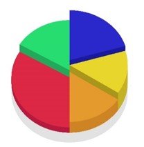
A pie chart is another mode in which data can be represented. It is a circular graph that resembles a pie sliced into pieces.
Each piece, or sector, represents a category, and the size of the piece shows how much of the whole it represents.
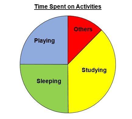
For example, if you divide your day into various activities such as sleeping, studying, playing, cleaning, and eating, you can use a pie chart to visualise how much time you spend on each activity.
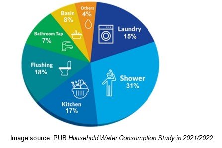
The diagram below shows an example of a pie chart.
Pie charts are particularly effective for displaying proportions, helping us see the relationship between parts of a whole.
They work well when you have a small number of categories and wish to compare their sizes.
For instance, imagine tracking the monthly budget of a family. A pie chart can instantly show how much of the budget goes towards rent, food, transportation, savings, and other expenses.
Why Use a Pie Chart?
Pie charts are popular because they offer a variety of benefits:
1. Easy to Understand: Pie charts provide a simple and clear visual representation of data, making it easy for readers to grasp the information quickly without extensive explanations.
2. Great for Comparisons: Pie charts help you quickly identify the largest or smallest categories. For example, in a chart showing favourite fruits among students, it is easy to see which fruit is most or least preferred.
3. Visually Appealing: A well-designed pie chart can make presentations and reports more engaging and professional. It uses colour and layout to highlight data effectively.
4. Widely Applicable: Pie charts are used in many fields, including education, business, government, and personal data tracking. Whether analysing election results or tracking your weekly schedule, a pie chart can simplify your data.
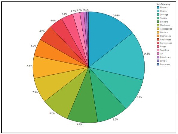
However, pie charts are not always ideal for every type of data.
They are less effective when you have a large number of categories or when the proportions are very similar, making it hard to distinguish between sectors.
In such cases, a bar graph or line chart might be a better choice.
The following is an example of a pie chart that is difficult to interpret. Observe that there are too many categories of data and many sectors are similar in size, making comparison of size difficult.
Parts of a Pie Chart
To understand how pie charts work, it is important to know their key components:
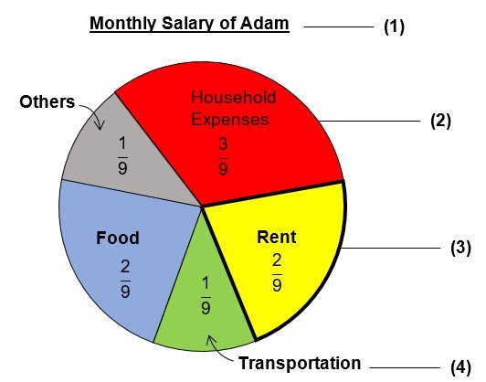
(1) Title: The title offers a short description of what the pie chart is representing. This helps the reader identify what they are about to look at. Here, the title is “Monthly Salary of Adam”. We would assume that this pie chart will provide information on how Adam spends his monthly salary.
(2) Circle: The entire circular shape represents 1 whole of the data. Each piece of the circle is a fraction of the whole.
(3) Sectors: These are the slices of the pie, each corresponding to a specific category. There are 5 sectors in the pie chart above. Observe that their size is proportional to the data they represent. For instance, the sectors for food and rent are equal in size so the amount spent on food and rent must be equal. Also the sector representing household expenses is the largest so Adam must have spent most of his salary on Household Expenses in comparison to other expenses such as food and transportation.
(4) Labels: Each sector is labelled with its category name, or fraction (or percentage, which we will learn in upper primary). Without clear labels, interpreting the chart can be confusing. Observe that all the fractions from all the sectors must add up to 1 whole.
How to Create a Pie Chart
Creating a pie chart may seem challenging initially, but with practice, it becomes easy. Here is a step-by-step guide:
Step 1: Collect and Organise Data
Start by gathering the data you want to represent. For example:
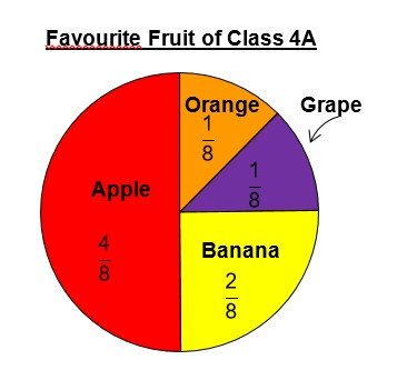
- Survey: Favourite fruits of pupils in Class 4A.
- Data: Apple (20), Banana (10), Orange (5), Grape (5).
- Total number of pupils: 20 + 10 + 5 + 5 = 40
Step 2: Convert Data into Fractions (or percentages at the upper primary)
Calculate the proportion of the total for each category:
- Apple: 20/40 = 4/8
- Banana: 10/40 = 2/8
- Orange: 5/40 = 1/8
- Grape: 5/40 = 1/8
Observe that the fractions representing pupils who chose apples and bananas are deliberately not expressed in their simplest form but with denominator 8 for easy comparison of proportion between all four categories.
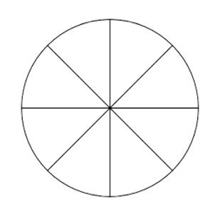
Step 3: Find the total number of unit slices
Note all the fractions for each category should ideally have the same denominator so that we will know the number of unit slices to cut the circle into. Since all the fractions above have denominator 8, then the circle must be cut into 8 equal slices as shown below.
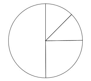
Step 4: Assign the unit slices to each category
According to the survey, there are 4 categories (or 4 types of responses): apple, banana, orange and grape.
Referring to the earlier collected data in Step 2, we have:
- Apple: 4/8
- Banana: 2/8
- Orange: 1/8
- Grape: 1/8
Hence, we will allocate the unit slices of the circle in the following way:
- Apples: 4 unit slices
- Bananas: 2 unit slices
- Oranges: 1 unit slice
- Grapes: 1 unit slice
Step 5: Add a Title, Labels and Colours (optional)
Add a title and labels to inform your readers what the pie chart and its respective sectors represent. Colour each sector differently to make the chart more engaging.
Interpreting Pie Charts
Reading a pie chart is as important as creating one. Follow these steps to interpret pie charts effectively:
1. Observe the Whole: The circle represents the entire collection of data. Every sector is a part of this total.
2. Compare Sector Sizes: Larger sectors represent bigger portions of the total. For instance, if the largest sector represents “Apples”, it indicates that more students prefer apples.
3. Use Fractions (or percentages, or even angles): Fractions help you understand the precise proportion each category represents.
4. Calculate Actual Numbers: If you know some data values in the pie chart, you can calculate some values that are not shown in the pie chart. For example, if it is known that one−quarter of the pie chart represents 15 surveyed pupils, we can obtain the total number of surveyed pupils by multiplying 15 with 4, to get 60.
Real-Life Applications of Pie Charts
Pie charts are not just for school—they are widely used in various areas of life, including:
1. Business: Displaying market shares, profit distribution, or sales data.
2. Science: Presenting survey results, experimental data, or statistical analysis.
3. Personal Life: Tracking activities, spending habits, or dietary patterns. For instance, tracking how you spend your monthly pocket money can help you identify areas to save.
Tips for Success
1. Double-Check Calculations: Ensure fractional values and parts add up to 1 whole.
2. Common sector size: Recognising quarters and halves will help you in calculations more efficiently.
3. Practise Regularly: Interpreting pie charts becomes easier with consistent practice.
Examples of Pie Chart Questions
1. The pie chart below shows the blood type (A, B, AB or O) for a group of pupils.

There are four times as many pupils with type−O blood as type−AB blood.
- How many pupils are there with type−AB blood?
20 ÷ 4 = 5 (ans) - What is the total number of pupils represented by the pie chart?
1 unit = 5
12 units = 12 × 5 = 60 (ans) - What fraction of the pupils has type−B blood? Express your answer in its simplest form.
15 /60 = 1/4 (ans) - How many more pupils have type−A blood than type−B blood?There are as many pupils with type−O blood as type−A blood.
20 – 15 = 5 (ans)
2. The pie chart below shows the favourite pastime of a group of children.
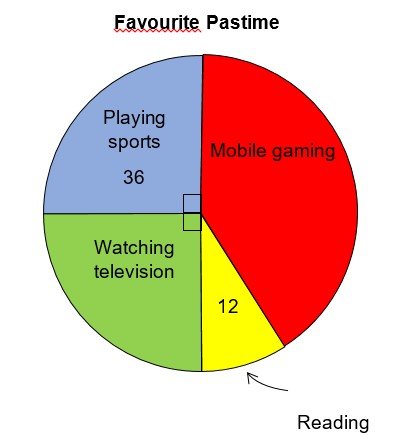
- What fraction of the children chose mobile gaming and reading as their favourite pastime? Express your answer in its simplest form.
1/4 + 1/4 = 1/2 (sports and tv)
1 – 1/2 = 1/2 (ans) - How many more children chose watching television than reading as their favourite pastime?
No. of children choosing sports and watching television are equal.
36 − 12 = 24 (ans) - What fraction of the children chose mobile gaming as their favourite pastime? Express your answer as a fraction in its simplest form.
No. of children who chose mobile gaming and reading = 36 × 2 = 72
No. of children who chose mobile gaming = 72 – 12 = 60
Fraction of children who chose mobile gaming = 60/72 = 5/6 (ans)
3. The pie chart below shows how Mr Lee spends his monthly salary.
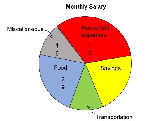
Mr Lee spends $1800 on household expenses each month.
- How much does he spend on miscellaneous expenses each month?
Household expenses is three times that of miscellaneous expenses.
Amount spent on miscellaneous expenses = $1800 ÷ 3 = $600 (ans) - The amount spent on miscellaneous expenses is equal to the amount spent on transportation. What fraction of his monthly salary does Mr Lee save? Express your answer in its simplest form.
1 – 1/3 – 1/9 – 1/9 – 2/9 = 2/9 (ans) - What is Mr Lee’s monthly salary?
1 unit = $600
9 units = $600 × 9 = $5400 (ans)
To Conclude
Pie charts are a wonderful tool for data representation, as they convey data visually and effectively. With practice, you can master both creating and interpreting them, making this skill useful for school projects and beyond.
Remember, the key to success is careful calculation, accurate measurements, and clear labelling.
So, keep practising, and soon, pie charts will feel as easy as pie!
Need More Revision Notes for Primary Math?
Check out our exam guide on other topics here!
Before you go, you might want to download this entire revision notes in PDF format to print it out, or to read it later.
This will be delivered to your email inbox.
Does your child need help with Mathematics?
1) Live Zoom Lessons at Grade Solution Learning Centre

At Grade Solution Learning Centre, we are a team of dedicated educators whose mission is to guide your child to academic success. Here are the services we provide:
– Live Zoom lessons
– Adaptably, an AI-Powered learning platform that tracks your child’s progress, strengths and weaknesses through personalised digital questions.
– 24/7 Homework Helper Service
We provide all these services above at a very affordable monthly fee to allow as many students as possible to access such learning opportunities.
We specialise in English, Math, Science, and Chinese subjects.
You can see our fees and schedules here >>
2) Pre-recorded Online courses on Jimmymaths.com

If you are looking for something that fits your budget, or prefer your child learn at his or her own pace, you can join our pre-recorded online Math courses.
Your child can:
– Learn from recorded videos
– Get access to lots of common exam questions to ensure sufficient practice
– Get unlimited support and homework help
You can see the available courses here >>